Monday 30 April 2012

For the love of Burlap...and my Grandma

Today I thought I'd post one of my favourite layouts so far. It was a shared effort between my sister Angela and I, and is a memorial for my Grandma who passed away at the end of February. Perhaps that's why I feel so strongly about it.  My Grandma's burial is this week and unfortunately neither my sister, brother nor I can make it. But we still wanted to be there in spirit, and thus we created a layout to place with her casket.  I believe it was very cathartic for my sister and I as we created it, and I think it will help bring support to my Mom and Dad in our absense at the burial....and somewhere up in heaven, I know it will mean so much to my Grandma.

My sister came up with the idea to send a poem to my Mom so that the minister could read it on behalf of the grandchildren and then it could be buried with my Grandma. I took this a step farther and suggested we do a small, framed 8x8 layout. I showed my sister a layout I had recently done for May's Paper Mixing Bowl challenge (stay tuned for the big reveal tomorrow). Angela loved it and we decided that the burlap would be our jumping off point. The next step was to find an appropriate poem. We spent the next 2 hours scouring various websites for poems, quotes and even song lyrics looking for just the right one that would capture our feelings in words. We finally found one that brought tears to our eyes and knew that it was the perfect poem. We then spent the evening watching Season 2 of Grey's Anatomy and creating handmade flowers for the layout. The next day I printed off the poem and we put it all together in a frame.

SOURCES:  Cardstock: Bazzil Basics Paper, Bo Bunny –Double Dot.  Paper:  Brown Parcel Paper, Burlap. Stamp: Fancy Pants – Pollen Dust. Ink: Memento – Rich Cocoa. Font: My Organization, CK Ali’s Hand. Flowers: Handmade Using Miscellaneous Paper & Embellishments
 

I love the rustic feel the burlap brings to the layout and I think my Grandma would really love it. So this one's for you Grandma, we love and miss you very much!
xo

Pin It!

Tuesday 17 April 2012

Superman!

This past weekend it was my cousin's 40th birthday party, and the big theme of the party was superheros. I knew that he loved Superman, so I decided I would make him up an 8x8 page that he could later put a photo in to remember the big surprise event. This was a little out of me league, but I tried to have fun with it and with the help of my husband and a little luck, this is what I came up with.

The only thing I used for it was cardstock and photoshop. The Superman logo and title I found on the internet, cropped and printed them off, then cut them out with scissors. My husband came up with the subtitle "Faster than a speeding bullet" and I thought it was cute to add the "40 years" to it. This was all done using the Tahoma font.  As for the background, my hubby insisted I had to have a red telephone booth somewhere on the page but there wasn't a whole lot of space to work with. After trying a few things, I decided I would just cut out the pattern of the glass door from the telephone booth onto red cardstock and lay a photo overtop. Once I put the page together however, I noticed that the photo would completely cover the phone booth detail...but as luck would have it a 4x6 photo would fit PERFECTLY if I slid it between the phonebooth and my black backdrop. Not only was the fit perfect, but you could also use a photo with either a landscape or a portrait orientation as they both fit in "snug as a bug in a rug!"

Thanks for checking in!

Pin It!

Thursday 5 April 2012

Spring has sprung on my picture wall!

My new spring pictures finally arrived for my seasonal picture wall! I had a hard time choosing which photos were going to adorn our dining room for this next season but I finally narrowed it down and ordered them from Scrapping Simply. If you have not heard of Scrapping Simply, I highly recommend you check out their website! I stumbled upon them in my search for a store that would print 12X12 size photos.  Not only do they print beautiful pictures with bright, vivid colours, but they do it for a fantastic price and only $5 shipping to Canada! Thanks Scrapping Simply!

Now for the big reveal:


As with the Winter wall, I designed two different pictures. The first was the letter "S" for Spring! This one took me a lot longer because I had to scroll through a gazillion fonts before I found something I liked for the letter "S." I finally decided on the font Earwig Factory, another favourite of mine from Kevin and Amanda. I spent a little extra time tweaking it by adding a wood grain pattern to the back. 

And now for my Spring words! My husband and I sat down back in January and brainstormed a few of the things we loved about Spring. I made a little collage of them and then added a tulip at the side for this season. I love how the leaves on the tulip turned out! This was completley by fluke as I was playing with a few of the blending options in Photoshop and just happened to come up with this. LOVE!

Now all I need is to get my butt in gear and start on my next home DIY project....an upcycled chandelier for the dining room! I love my red pendant lights but they are just not conducive with scrapbooking because they don't give off nearly enough light. Stay tuned and thanks for stopping in! 

Pin It!

Sunday 1 April 2012

The Paper Mixing Bowl: Recipe #2

Here is the recipe for our second Paper Mixing Bowl challenge:


I found this particular recipe to be quite challenging as the layout was so fun and upbeat and that was definitely not where I was at on an emotional level. So after jotting down several ideas and spending several days brainstorming, I decided to sort through some old photos and came across one taken on my first scrapbooking crop. It brought back so many happy memories and I knew it was perfect for the layout. So here is my take on Hot Cross Buns:


SOURCES: Cardstock: Bazzil Basics Paper. Patterned Paper: BasicGrey Bo Bunny – Kiwi Double Dot. Font:  PAss the CheX, Wanda’s Write, Pea Stacy’s Doodles, Too Much Paper.
 The main ingredient was white so I decided right away that I would use a simple, plain white background for my layout. One of my favourite shapes to use is squares, especially if they have rounded corners, so that is the shape I decided to feature throughout the page and it also incorporated the corner punch utensil. I had been toying with using burlap on a layout for a while now and this seemed like as good a time as any, so I cut and frayed the edges of it for my backdrop and then used some strands from the burlap to add my version of the stitching detail to the page. I had wanted to use chipboard to add some dimension to the square detail at the top and bottom of my page but I didn't have any on hand so I used some foam tape to pop a few of the squares up instead.


For the journaling aspect, I featured a quote from that day that my scrapbook friends and I still joke about...it brought a smile to my face just typing it out. The recipe asked us to write about a new beginning or a new adventure in our life, which inspired the title of my page "Adventures in Scrapbooking." I also loved the idea of using a numbered list so I journalled about the beginning of my friendship and new found love of scrapbooking in this style.

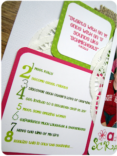
I love stickles, so I knew I was definitely using that utensil on my page. I ended up adding a smidget to the flower on my title and then very slowly traced the entire word "Scrapbooking." It added just the right amount of sparkle! I was very excited about using doilies in my layout so I made a stop at the dollar store and picked some up in two different sizes. What I had originally envisioned doing looked way better in my head than it did on paper, so instead I made the doilies into a flower and folded a few extra pieces so that it looked like lace peaking out from under the paper layers. I really loved how the doilies softened the look of the burlap and added a touch of femininity to the page.

Well, that's it for another challenge; I can't wait to get started on the next one!

Cheers!

Pin It!